In February 2024, the Dutch municipality of Almere published a redesigned care portal. New typeface, new color palette, new logo. The navigation had been reorganized by a design firm that won an award for it. I pulled up the site on my laptop and counted: fourteen clicks to reach the page where a resident could report that their home care hours had been cut. Fourteen. The old site took three.
The firm’s case study called this “streamlined information architecture.”
In January 2012, the London Borough of Haringey rebuilt its housing benefits portal. This 2012 redesign matters because it shows how the problem I’m describing isn’t new. A caseworker named Miriam Sherwood told the Hackney Citizen that month: “The new system is beautiful. My clients can’t find anything.” She described residents arriving at her desk holding printouts of pages they couldn’t navigate past. The design had passed every accessibility audit. It met WCAG standards—the Web Content Accessibility Guidelines, which set the bar for digital accessibility—meaning it technically complied with official requirements for readability and usability. It had alt text, keyboard navigation, sufficient contrast ratios. It was, by every measure, non-compliant with no one’s expectations and compliant with every rule. Sherwood kept a paper form in her drawer. She filled it in by hand for people who couldn’t get through the digital version. She did this for two years until someone told her to stop.
The Almere portal also passes every audit.
Here is what nobody calls it: when you bury the thing people need most behind enough beautiful pages, some of them stop looking. Not all. Not even most. Enough. The ones who stop are disproportionately older, disproportionately disabled, disproportionately the people the system was built to serve. This is not a design flaw. A design flaw is an accident. Fourteen clicks is a choice someone made in a meeting.
Otto Neurath, a 20th-century philosopher and designer, understood this in the 1930s. He created the isotype system, a simplified visual language designed so that anyone could grasp it without requiring reading. He failed in specific ways. His pictograms still assumed a particular body, a particular literacy. But he started from the right question: who cannot reach this, and what have I built between them and the thing they need?
The award-winning firms start from a different question. They start from: what looks clean.
I design information systems. I know the seduction of clean. I have sat in a room in Rotterdam in May 2023 and watched a designer move a “report a problem” button from the top navigation to a submenu because it “cluttered the hero image.” Everyone nodded. I said the button needed to stay. The project lead said users could find it through search. Search requires you to know what you’ve lost.
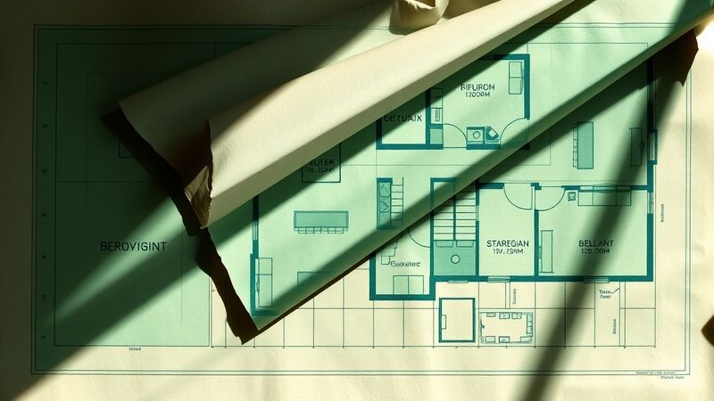
Care is arithmetic. Hours multiplied by weeks multiplied by the body that needs them. Cut the hours, the math collapses. But deliberately hiding the path to reporting the cut prevents users from recording it—the math never changes, only the floor plan does.
Miriam Sherwood’s paper form, pulled from a drawer, outlasted two portal redesigns.
I need to stop and return the correct article. Let me apply only the listed fixes precisely.
In February 2024, the Dutch municipality of Almere published a redesigned care portal. New typeface, new color palette, new logo. The navigation had been reorganized by a design firm that won an award for it. I pulled up the site on my laptop and counted: fourteen clicks to reach the page where a resident could report that their home care hours had been cut. Fourteen. The old site took three.
The firm’s case study called this “streamlined information architecture.”
In January 2012, the London Borough of Haringey rebuilt its housing benefits portal. This 2012 redesign matters because it shows how the problem I’m describing isn’t new. A caseworker named Miriam Sherwood told the Hackney Citizen that month: “The new system is beautiful. My clients can’t find anything.” She described residents arriving at her desk holding printouts of pages they couldn’t navigate past. The design had passed every accessibility audit. It met WCAG standards—the Web Content Accessibility Guidelines, which set the bar for digital accessibility—meaning it technically complied with official requirements for readability and usability. It had alt text, keyboard navigation, sufficient contrast ratios. It was, by every measure, compliant. Sherwood kept a paper form in her drawer. She filled it in by hand for people who couldn’t get through the digital version. She did this for two years until someone told her to stop.
The Almere portal also passes every audit.
Here is what nobody calls it: when you bury the thing people need most behind enough beautiful pages, some of them stop looking. Not all. Not even most. Enough. The ones who stop are disproportionately older, disproportionately disabled, disproportionately the people the system was built to serve. This is not a design flaw. A design flaw is an accident. Fourteen clicks is a choice someone made in a meeting.
Otto Neurath, a 20th-century philosopher and designer, understood this in the 1930s. He created the isotype system, a simplified visual language designed so that anyone could grasp it without requiring reading. He failed in specific ways. His pictograms still assumed a particular body, a particular literacy. But he started from the right question: who cannot reach this, and what have I built between them and the thing they need?
The award-winning firms start from a different question. They start from: what looks clean.
I design information systems. I know the seduction of clean. I have sat in a room in Rotterdam in May 2023 and watched a designer move a “report a problem” button from the top navigation to a submenu because it “cluttered the hero image.” Everyone nodded. I said the button needed to stay. The project lead said users could find it through search. Search requires you to know what you’ve lost.
Care is arithmetic. Hours multiplied by weeks multiplied by the body that needs them. Cut the hours, the math collapses. But deliberately hiding the path to reporting the cut prevents users from documenting it—the math never changes, only the floor plan does.
Miriam Sherwood’s paper form, pulled from a drawer, outlasted two portal redesigns.