In June 1880, 164 hearing educators voted to ban sign language from Deaf schools across Europe. The resolution passed at the Congress of Milan. One Deaf delegate attended. The typeface on the congress proceedings was a heavy serif, the kind that signals authority. I think about that typeface more than I think about the vote itself.
Here is why. The vote was explicit. Someone could read it, understand it, oppose it. The typeface was ambient. It told you who was speaking before you read a word. It said: this is serious knowledge produced by serious people. It wrapped 164 hearing men’s fear of a language they could not control in the visual grammar of legitimacy. The ban lasted a hundred years. The typeface did half the work.
You might say: that is a stretch. Typography does not oppress people. People oppress people. Fine. Let me show you something closer.
In 2017, the London Design Museum held an exhibition called “Hope to Nope: Graphics and Politics 2008–18.” Ellen Lupton, the curator and typographer who wrote Thinking with Type, has made the point repeatedly that font choice is a power decision disguised as an aesthetic one. She is right, but she does not go far enough. Font choice is an epistemological decision. It determines not just how knowledge looks but who the knowledge belongs to.
I sat in a municipal planning office in Rotterdam in February 2022 and watched a Deaf colleague try to submit a formal objection to a building permit. The form was in 9-point Univers. The instructions ran to four pages. The language was legal Dutch. My colleague’s first language is Nederlandse Gebarentaal — Sign Language of the Netherlands. She is fluent in written Dutch the way I am fluent in written English: competently, with effort, as a second language she taught herself because nobody taught her. The form was not designed to exclude her. The form was designed to not think about her at all.
The font was small because someone decided that density signals seriousness. The language was legal because someone decided that precision requires jargon. Every one of those decisions was made by a hearing person in a room where no Deaf person sat. The form passed every accessibility check. It met the standard.
The standard had become more real than the person it was written for.
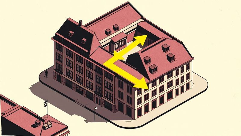
Here is the other city. In 2014, Vienna redesigned its entire public signage system. The city hired information designers who tested prototypes with elderly residents, wheelchair users, people with low vision, and — this is the part that interests me — Deaf Viennese citizens who navigate primarily by visual and spatial cues. The designers discovered that Deaf testers consistently outperformed hearing testers on wayfinding tasks when the signage used spatial hierarchy instead of text labels. Larger zones of colour. Fewer words. Directional logic built into the layout itself, not bolted on through language.
The Vienna system did not caption the city for Deaf people. It redesigned the city’s visual logic so that text became one layer among several, not the primary carrier of meaning. Otto Neurath tried something similar in the 1930s with his Isotype picture language — universal visual communication that would cross linguistic borders. Neurath’s project failed because he still believed in a single universal reader. Vienna’s worked better because the designers started from specific readers who navigated differently.
Rotterdam’s form was accessible. Vienna’s signage was legible. The gap between those two words is the entire problem.
Accessible means: a hearing person checked a box. Legible means: a Deaf woman found the building without asking anyone.
Christine Sun Kim made a piece in 2015 called The Enchanting Music of Sign Language. That title is already doing the thing I am describing. It takes a sensory category that excludes her and reclaims it by redefining what music means. She did not ask to be included in hearing music. She redrew where music lives. Typography that works for Deaf people does the same thing. It does not add captions to a text-first system. It refuses the premise that text comes first.
I label things in my apartment on Tuesday mornings. I own a label maker. The labels are not for function — I know where the cinnamon is. The labels are for the pleasure of a visual system that matches the spatial logic of the shelf. The serif I use is 12-point Georgia. Readable. Warm. Honest about its own weight. I cannot explain why this matters to me without explaining what it feels like to spend your entire life inside information systems designed by people who process the world ears-first and then act surprised when you cannot find the exit.
The Congress of Milan chose its typeface in 1880. A hundred and forty-four years later, a Deaf woman in Rotterdam holds a form in 9-point Univers, and the font already knows she is not the intended reader.