There are arts venues that have won accessibility awards. There are Deaf visitors who followed their directions exactly and stood outside, circling, unable to find the entrance. These are, frequently, the same venues.
I design information systems for a living. I have stood outside more buildings than I can count, holding a phone that assured me I had arrived while the actual entrance was invisible. The page told me which bus. Which train. That there was step-free access. It did not tell me where the door was when I could not hear someone say “around the back.” It did not tell me what I would encounter between the bus stop and the threshold.
It left out the building itself.
Access directions that end at the property line are not about access. They are about liability. The difference is the difference between a map that shows you the territory and a map that shows you what the mapmaker is willing to be responsible for.
The property line
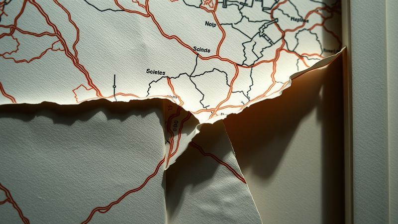
Let me describe a building I visited in October 2024. A mid-sized arts venue in South London. Their website had a “Getting Here” section. It listed three bus routes, one Tube station, a note about the nearest accessible parking bay. It mentioned that the main entrance had level access. It included a photograph of the front of the building, taken on a sunny day, at a distance that made the whole façade legible in a single glance.
I arrived at dusk. The bus stop was across a four-lane road with no controlled crossing within sight. The pavement between the road and the building had been resurfaced in a pattern that obliterated the tactile paving. The “main entrance” with its level access was around a corner from the street-facing side, marked by a sign I could see only because I had been told, via email, to look for it. The photograph on the website had been taken from inside a car park that was closed to the public.
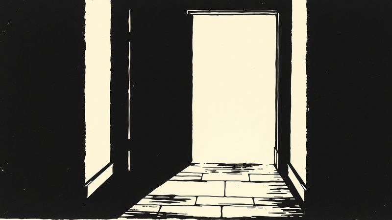
Now let me describe another building. The Haags Gemeentemuseum in The Hague. Designed by H.P. Berlage and completed in 1935. It turns out Berlage was obsessed with the idea that a building should explain itself. The approach to the museum is a sequence of spatial cues — changes in material underfoot, a long reflecting pool that orients your body toward the entrance axis, a portico scaled so that you understand you are arriving before you reach the door. None of this was designed for disabled visitors. Berlage was not thinking about us. But the principle underneath it — that the building owes the approaching body an explanation of itself — that principle is the thing missing from every “Getting Here” page I have ever read.
The South London venue had a page. Berlage had an architecture.
What the page protects
Here is the concession I owe. “Getting Here” pages represent real effort. Someone sat down and thought about how people arrive. Someone compiled bus numbers and parking information and asked about lifts. In many cases, that someone is a single access officer or a front-of-house manager doing this work on top of everything else, unpaid or underpaid for the specificity it demands. The impulse is genuine. The information is not wrong.
It is just not enough.
The problem is not the page. The problem is what the page has replaced. A “Getting Here” section functions, institutionally, as proof that access was considered. It becomes the artifact that satisfies the compliance question. Did you provide access information? Yes. Here it is. The page exists so the institution can point to it. And pointing to it becomes the end of the process, not the beginning.
I know this because I have been the person institutions hire to audit their information systems. I have watched the moment when a venue director realizes that their “Getting Here” page has been copy-pasted from a template provided by their local council’s tourism board. The bus numbers were correct. The map was a screenshot from Google. What I did not expect — still do not, no matter how many times I see it — was that the access information described the building as it was meant to be, not as it is. The director knew. She said, “We update it when someone complains.” She was not cruel. She was describing a system that treats access information as reactive — as response to failure, not as a design practice.
Wayfinding is not directions
Turn left. Take the 37 bus. Use the rear entrance. These are commands. They assume a body that can execute them in sequence, with the senses to identify “left” and “rear” in an unfamiliar environment, that can parse instructions delivered in text and hold them in working memory while navigating physical space.
Most access information operates entirely in this mode. What it does not do is tell you where you are.
There is a name for the thing that does. Wayfinding. It is not the same as giving directions. Directions tell you what to do. Wayfinding tells you where you are. Wayfinding creates an environment that communicates spatial information continuously, through multiple channels, so that a person can orient themselves without instructions. The Dutch urbanist Steen Eiler Rasmussen wrote about this in the 1950s. The contemporary version is less poetic and more computational, but the core insight holds: a well-wayfound environment does not need to tell you where to go because it shows you where you are.
I am Deaf. I navigate primarily through vision and spatial reasoning. When I approach a building I have never visited, I am reading the environment the way you might read a paragraph — scanning for structure, hierarchy, emphasis, anomaly. A door that is set back from the façade reads differently from a door that is flush. A change in paving material communicates a threshold. A window that is lit reads as occupied. These are not accommodations. They are information. And most “Getting Here” pages assume I will not need them because the page has already told me what to do.
The assumption underneath the page is that access is a problem of information delivery. Give people the right data and they will navigate. This is wrong. Access is a problem of information architecture — of how a space is structured to communicate with the bodies moving through it.
The fire alarm problem
I learned the difference between information delivery and information architecture when I was nine years old, standing in a classroom that was emptying around me. A fire alarm I could not hear had activated. The other children moved toward the door. No one touched my shoulder. I watched the chairs empty and I did not understand the pattern until I saw the hallway through the open door, full of bodies moving in one direction.
The school had a policy. The policy said a teacher would alert any deaf student during an emergency. The teacher was already in the hallway. The policy was information delivery. What would have saved me was information architecture — a visual alarm, a strobe, a vibrating puck under my chair, any system that communicated through a channel my body could receive without depending on a single person remembering to act.
This is the exact same structural failure as the “Getting Here” page. The page is the policy. It says: we have told you how to arrive. If you cannot arrive using this information, the failure is in the gap between our instructions and your body. The architecture would be different. The architecture would say: we have made the approach legible in every channel we can think of, and we are still learning which channels we have missed.
Two ramps
Here are two ramps.
The first is at a cultural venue in East London. It was added after the building opened, bolted to the side of a short flight of steps. It is exactly the minimum width required by Public Right-of-Way Accessibility Guidelines. It is steep enough that a manual wheelchair user needs momentum to make the turn at the top. It ends at a door that opens outward, toward the person on the ramp. There is no level landing. The ramp is painted grey. It is technically compliant.
The second is at the Centraal Museum in Utrecht. The entrance was redesigned in 2019. The ramp is not a ramp. It is a gradual slope integrated into a public courtyard that approaches the museum entrance at a gradient so gentle you do not register the elevation change until you are at the door. The slope is the approach. Everyone uses it. It is paved in the same stone as the surrounding square. There is no moment where you are sorted into “stairs person” or “ramp person.” You are just a person approaching a building that has made its entrance legible to your body.
The East London venue has a “Getting Here” page that says “ramped access at the main entrance.” The Utrecht museum’s page says less about access because the building says it instead.
I am not arguing that the Utrecht model is easy or cheap. It required an architectural intervention. It required money. It required someone with decision-making power to say: the approach is part of the building, and the building must explain itself to every body that approaches it. That is a design commitment, not a compliance exercise. And it is precisely the commitment that a “Getting Here” page allows an institution to defer.
Typography, again
This connects to something I notice in every “Getting Here” page I audit, and it is a typography problem before it is an access problem. The information is presented in a single register. Same font weight, same size, same spatial hierarchy for “take the Northern Line to Kennington” and “the venue has a hearing loop.” These two pieces of information are not the same kind of information. One is logistical. One is architectural. One tells you what to do before you arrive. The other tells you what the building will do when you are inside it. But they are typeset identically, which means they are treated identically, which means they are thought about identically.

Christine Sun Kim made a piece called “All Day” in 2012 that charted the volume levels of her daily life as perceived by hearing people around her. The work made visible the hierarchy that hearing culture imposes on sound — which sounds are acceptable, which are disruptive, which are inaudible and therefore nonexistent. She was mapping a power structure through information design. The “Getting Here” page does the opposite. It flattens a power structure into a uniform list so that the hierarchy disappears. The bus route and the wheelchair ramp occupy the same visual weight. But they are not the same. One is infrastructure that exists for everyone. The other is an accommodation that was fought for, legislated, and is maintained only as long as someone checks.
When I design information systems, I use typographic hierarchy to make power visible. Bold weight for the thing the institution controls. Regular weight for the thing the visitor controls. Italic for the thing no one controls — the construction on the corner, the broken lift, the weather. This is not a gimmick. It is an admission that access is distributed across actors, and the institution is only one of them.
What a real approach page would say
A real approach page would describe the journey from the nearest transit stop to the door, in sensory terms, including what you will see, what the ground surface is, where the curb cuts are, and where they are not. It would include a photograph taken from the direction of approach, not from inside a car park. It would distinguish between permanent features and temporary conditions. It would name the specific access features of the building and state plainly what is not accessible. It would be updated when something breaks and not when someone complains.
This is not utopian. This is what Carmen Papalia has been arguing for years through his non-visual access work — that the institution’s job is not to list accommodations but to describe the sensory reality of its space honestly, including the parts that fail. Papalia calls this “open access.” I would call it something more blunt. I would call it telling the truth about your building.
The room
Most “Getting Here” pages are not really about getting here. They are about the institution’s relationship to its own threshold. The threshold is where the institution’s control begins, and the page marks that boundary. Everything before the threshold is someone else’s problem. The bus system. The pavement. The crossing. The weather. The fact that dusk changes everything.
The page draws a line. On this side, we are responsible. On that side, you are on your own.
I stood outside that South London venue for eleven minutes, in October dark, circling a building that had assured me it was accessible, looking for the door that was around a corner I could not see from the street, and I thought about Berlage’s museum in The Hague, which I visited once in heavy rain, and found the entrance without looking at my phone, because the building told me where it was.
This article was inspired by Getting here - from tangledarts.org.