
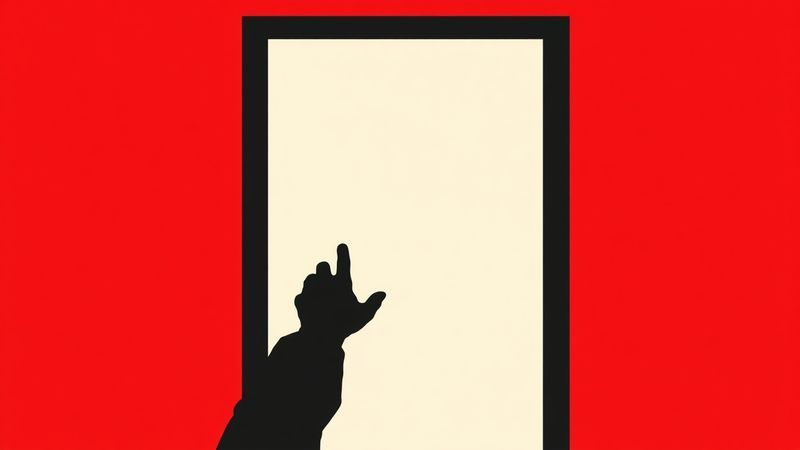
The first thing you notice is the softness. Then you notice you’re lost.
I’m standing in a transit hub that cost hundreds of millions of dollars. The gradients on the walls are gorgeous. The typeface was chosen for warmth. The color palette whispers instead of speaking.
And I can’t find the exit, because the exit looks exactly like the wall beside it.
The information is there. It’s just dressed in someone else’s language.
This building was designed by someone who thinks wayfinding is decoration. But I navigate by visual hierarchy. And let me tell you what they’re missing.
The Day I Learned What Buildings Say
I am Deaf. Contrast, scale, spatial rhythm, typography—these are not aesthetic preferences. They are my orientation system.
When I walk into a train station, I’m not looking for signs the way a hearing person does. A hearing person has redundancy. Announcements overhead. Someone at an information desk they can ask. The low murmur of a crowd shifting toward a platform, which tells them something has changed even before they read the departure board.
I have the board. I have the signs. I have what is printed, posted, illuminated, and architecturally implied. If those fail, I have nothing.
You might say: but don’t phones fix this? Apps, live captioning, real-time transit updates? They help. They also assume battery life, data signal, and literacy in the app’s language.
I watched a Deaf elder in the Bronx stand in front of a subway kiosk for eleven minutes trying to find the accessibility menu. The kiosk had been redesigned six months earlier. The new interface buried the visual route map behind two taps and a dropdown labeled “More Options.” The old one had the map on the home screen.
Progress.
Two Buildings. Same Function. Different Worlds.
The Barbican Centre in London, opened in 1982. Brutalist. Infamous for its wayfinding. Yellow lines painted on the floor to guide visitors through the labyrinth—added after the building opened because people kept getting lost.
I visited in September 2019. I loved the concrete. I could not find the cinema. The yellow lines had faded in places and been painted over in others. I followed one into a dead end near a service corridor. A maintenance worker pointed me toward a fire door and mimed “through there, left, left.”
She had improvised a route that the building’s own signage could not provide.
The Stedelijk Museum in Amsterdam, reopened after renovation in 2012. Clean sightlines. High-contrast typography. Room numbers large enough to read from the entrance of each gallery. Floor plan available in a single visual scan from the main lobby.
I visited in June 2018 and I cried. Not because of the art. Because I knew where I was. Every second. Without asking. Without my phone. Without translating someone else’s spatial logic into mine.
Same function. Same cultural category. One building that treats orientation as the visitor’s problem. One that treats it as the building’s job.
That’s the difference between designing for assumptions and designing for bodies.
The Stedelijk didn’t do this for me specifically. It did it because Dutch design has a particular obsession with visual clarity dating back to the 1920s—the same tradition that gave us Neurath’s Isotype pictograms and social housing projects where apartment layouts were designed so a resident could see the front door from the kitchen.
The principle was not accessibility. It was democracy. The idea that spatial information should not require expertise to decode. That if you have to be trained to read your own environment, the environment has failed.
This principle is wildly unfashionable.
The Contradiction I Can’t Resolve
Here’s where it gets complicated. Not every disabled person needs what I need. Some need the opposite.
A colleague wrote recently about open offices and the autistic need for environments rich in pattern—surfaces that carry information unfolding over time, detail that rewards sustained attention. I understand this completely. For them, a minimalist space is an impoverished one, stripped of the texture their perceptual system needs to feel oriented.
The patterned wall that gives them a foothold destroys my sightlines. When every surface carries dense visual information, I lose the hierarchy. I can’t distinguish the emergency exit sign from the decorative tile from the directional arrow. It all becomes signal. Which means it all becomes noise.
They call my clean sightlines “impoverished.” I call their patterned walls illegible. We are both right. The same surface. Different perceptual economies.
This is the thing accessibility checklists cannot touch. The WCAG 2.1 guidelines will tell you about contrast ratios and text alternatives and focus indicators. They will not tell you that two disabled people can need opposite things from the same wall.
The checklist assumes a single axis of access. The reality is a grid.
Some part of me—the part that relabels things on Tuesday mornings because the font was wrong—believes visual clarity isn’t just my need. It’s a public good. That legible environments reduce cognitive load across the board.
I believe this. And I know it’s a form of imperialism. My perceptual system dressed up as universal principle.
I hold that contradiction. I don’t resolve it.
The Approach Is the Architecture
Tangled Art + Disability’s Getting Here project documents the specific, grinding, physical reality of how disabled people get to cultural events. Not what happens inside the gallery. What happens between your front door and the venue’s front door.
The curb cuts that end in a lip. The ramp that deposits you at a locked entrance. The wayfinding that assumes you already know where you’re going.
“Getting here” is itself a design artifact. It is produced. The difficulty is not natural.
Someone chose the signage hierarchy. Someone chose the font size. Someone decided which entrance would be primary and which would be “accessible”—a word that, in architectural practice, almost always means “secondary.”
Kevin Lynch wrote The Image of the City in 1960. The same year William Stokoe published his proof that ASL is a complete language. Two texts about legibility—one about urban space, one about human communication—published in the same year, and they never touched.
Lynch’s five elements of urban legibility—paths, edges, districts, nodes, landmarks—describe exactly how I navigate. Visually. Spatially. By contrast and hierarchy. But Lynch assumed a viewer who could also hear the city. The honking that tells you the intersection is close. The change in ambient sound when you enter a tunnel.
His legibility had a soundtrack. Mine doesn’t.

Why This Matters Beyond Disability
Navigation difficulty is distributed along the same lines as every other form of power. If you are hearing, sighted, ambulatory, and literate in the dominant language, the building speaks to you. It was designed to.
Everyone else is translating. And translation is labor. Unpaid, unacknowledged, constant.
What I want is simple. For the approach to be designed as carefully as the interior. For the journey to the building to be understood as part of the building. For the sign at the bus stop to use the same typographic system as the sign in the lobby. For the curb cut to aim at the entrance, not at the parking lot. For the fire alarm to strobe.
I’m not asking for beauty. I’m asking for the information to be where I can see it.
In fourth grade, the fire alarm went off and I learned what I was worth to the room by watching every chair empty around me while I sat still. Not because I was calm. Because no one had put the information where my body could receive it.
The system worked. It saved everyone it was designed to save.
The chairs were red plastic, bolted to metal desks, and when the room emptied they stayed exactly where they were.
This article was inspired by Getting here from tangledarts.org.