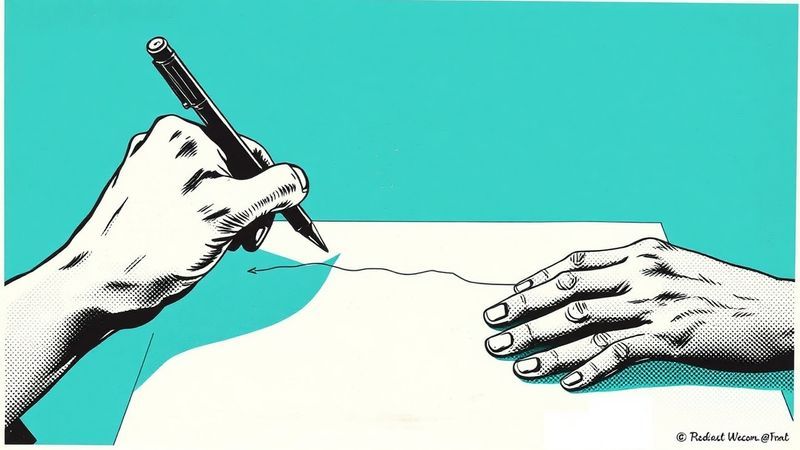
Mara pointed at the crosswalk outside the café window and told me to watch.
“Hearing people listen for cars,” she said. “I watch patterns.”
Her finger traced invisible lines in the air—the rhythm of traffic lights, the flow of pedestrians stepping off curbs, the gaps between movements that signal when it’s safe to cross. She wasn’t missing information. She was reading a completely different dataset.
Mara is deaf. She’s also the best interface designer I’ve ever worked with. And those two facts are not unrelated.
I’ve spent fifteen years designing digital products. I’ve won awards. I’ve shipped interfaces used by millions of people. But it took Mara exactly one afternoon to show me that I’d been designing for the wrong kind of seeing my entire career.
A Beautiful Dashboard That Made People Sick
Last year, a financial services company called us in a mild panic. They’d just launched a new analytics dashboard. It was gorgeous—the kind of interface that wins design awards and gets featured on every blog that covers digital craft. Smooth animations. Rich depth effects. Elements that floated and responded to cursor movement like living things.
Users were getting headaches. Some reported motion sickness. Error rates were climbing. People were avoiding the tool entirely.
The design team was baffled. They’d followed every best practice. They’d nailed their color palette. Their typography was impeccable. The animations were butter-smooth at 60 frames per second. By every metric the design industry cares about, they’d built something exceptional.
And it was actively hurting the people who had to use it eight hours a day.
We spent an afternoon with the dashboard. I was still cataloging issues when Mara found the core problem in thirty minutes.
“Look,” she said, her eyes moving across the screen in the methodical scanning pattern I’ve come to recognize over years of working together. “Forty-seven different animations. Twelve colors competing for attention simultaneously. Parallax scrolling that confuses spatial depth. There’s no clear path for the eye to follow.”
She wasn’t critiquing the interface. She was diagnosing it—the way a doctor reads an X-ray while the patient only sees grey smudges.
The dashboard was a visual cacophony dressed up as elegance. And it took someone who navigates the world through visual structure—not auditory cues—to hear how loud it was screaming.
How Deafness Creates a Different Kind of Expertise
Here’s what most people misunderstand about deaf experience: they think it’s about absence. About the missing sense. About what isn’t there.
Mara describes it differently. Growing up deaf taught her to be a cartographer. When the world isn’t designed for your navigation system, you learn to draw your own maps. You develop an almost architectural understanding of visual space—what flows, what blocks, what guides attention, what scatters it.
At that crosswalk outside the café, hearing pedestrians process traffic as background audio. Sound does the spatial work for them. Mara processes the same intersection as a complex visual system—timing patterns, motion vectors, spatial relationships between moving objects. She doesn’t just look at things. She reads the structural logic underneath them.
This isn’t compensation. It’s specialization. And it produces a kind of visual expertise that the design industry desperately needs but rarely thinks to seek out.
 Visual hierarchy and scanning patterns
Where most designers see pixels, Mara sees relationships. Where they see beauty, she sees flow. Where they see a delightful animation, she asks: what is this motion communicating? Is it guiding the eye or distracting it? Does it serve the user’s task or the designer’s portfolio?
Those forty-seven animations on the financial dashboard? They delighted the design team during the build. They made the demo reel sing. But they created a visual environment with no hierarchy—every element competing for attention simultaneously, like forty-seven people talking at once in a room with no acoustic treatment.
The dashboard was designed by people who could hear. People who unconsciously relied on audio cues, system sounds, and notification chimes to orient themselves in digital space. They’d built a visual layer that looked spectacular but didn’t actually do the navigational work that visual design is supposed to do.
Mara couldn’t fall back on audio. So she saw, immediately, that the visual map was broken.
Eight Animations Instead of Forty-Seven
We didn’t gut the dashboard. We didn’t make it ugly. We made it legible.
Of the forty-seven animations, we kept eight—the ones that actually communicated something. A loading state. A transition between data views. A confirmation that an action had registered. Movements that meant something, rather than movements that just moved.
Twelve competing colors became five, each with a specific job. Red meant something was wrong. Blue meant navigation. Green meant confirmation. Grey meant background. No color existed just because it looked nice next to another color.
The floating parallax effects disappeared entirely. In their place: consistent spatial depth that told users where they were in the information hierarchy. Foreground elements were interactive. Background elements were context. The eye knew where to go because the map was finally drawn clearly.
The results were not subtle. Tasks that took forty-two seconds dropped to nineteen. Error rates fell from 18% to 3%. The headache complaints stopped. People started choosing to use the tool instead of avoiding it.
The interface didn’t lose its beauty. It lost its noise. And in the silence, the actual design started working.
The Education Gap No One Talks About
After the dashboard project, Mara and I visited design schools. We wanted to understand why a team of talented, well-trained designers had built something that made users physically ill.
What we found was a curriculum-shaped hole.
Students were learning color theory, typography, composition, motion design. They were building portfolios full of interfaces that would make recruiters swoon. They were mastering tools that could produce any visual effect imaginable.
No one was teaching them that beauty could be painful.
No one was teaching them to distinguish between visual delight and visual noise. Between an animation that guides and an animation that distracts. Between a color palette that communicates and one that overwhelms.
We showed one class an award-winning interface. They admired it. Then we showed them the user feedback: “This gives me headaches.” “I can’t find anything.” “The animations make me nauseous.” “I dread opening this app.”
The confusion on their faces was genuine. They’d been trained to create exactly this kind of work. They’d been rewarded for it. Their professors had praised it. The industry had celebrated it.
And no one had told them it was hurting people.
The design industry has an aesthetic monoculture. It trains designers to see the way sighted, hearing, neurotypical people see—and then calls that “universal design.” It optimizes for the screenshot, the case study thumbnail, the three-second portfolio scroll. It builds instruments and calls them sculptures.
Sound familiar? Architecture has the same problem. So does urban planning. So does product design. Entire industries optimizing for one sensory experience while ignoring how human bodies actually navigate space.
The Cartographers Are Your R&D Department
Here’s what I’ve learned from working with Mara for six years: her deaf expertise isn’t an accessibility accommodation. It’s a competitive advantage that the design industry is leaving on the table.
Every time she walks into a project, she sees structural problems that hearing designers miss. Not because hearing designers are bad at their jobs—but because they’ve never needed to develop the kind of visual-structural literacy that deaf navigation demands.
Mara reads an interface the way a blind architect reads a building’s acoustics. The way a wheelchair user reads a floor plan’s flow. The way a neurodivergent thinker reads a system’s logical patterns.
These aren’t deficits that need accommodation. They’re specialized expertise that produces better design for everyone.
The financial dashboard didn’t get fixed because we added accessibility features. It got fixed because a deaf designer saw the structural problems that hearing designers couldn’t—and her solutions made the product better for every single user, disabled or not.
 The map beneath the map — a waveform dissolving into the language of navigation
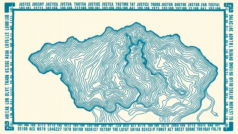
The Map Beneath the Map
Every interface has two layers. There’s the surface—the colors, the animations, the visual polish that makes screenshots look stunning. And there’s the map underneath—the structural logic that tells human brains where to look, what to do, and how to navigate.
Most designers are trained to perfect the surface. The cartographers—the people who’ve spent their lives navigating worlds not built for them—see the map.
Mara and I are now building what we call Structural Legibility Protocols for design teams. Not accessibility checklists. Not disability accommodations. A fundamental reorientation of the design process that starts with the map instead of the surface. How does a human eye actually move through this space? What’s communicating, and what’s just decorating? Where does attention go, and is that where it should go?
The most usable interfaces of the next decade won’t come from designers who make the prettiest surfaces. They’ll come from designers who draw the clearest maps. And the clearest maps will be drawn by people who’ve been forced to become cartographers.
We don’t need better-looking design. We need design that works like a well-drawn map—where you always know where you are, where you’re going, and how to get there.
Question worth sitting with: Open the app you use most. Close your eyes for ten seconds, then look at the screen fresh. Can you see the map? Or just the decoration?